A top of mind brand design remedy for Well Pharmacy
The Brief
How do you create stand out and memorability in a largely uninspiring sector where all brands look the same?
By making it easier for people to identify Well with distinctive brand assets that build mental availability.
Our Approach
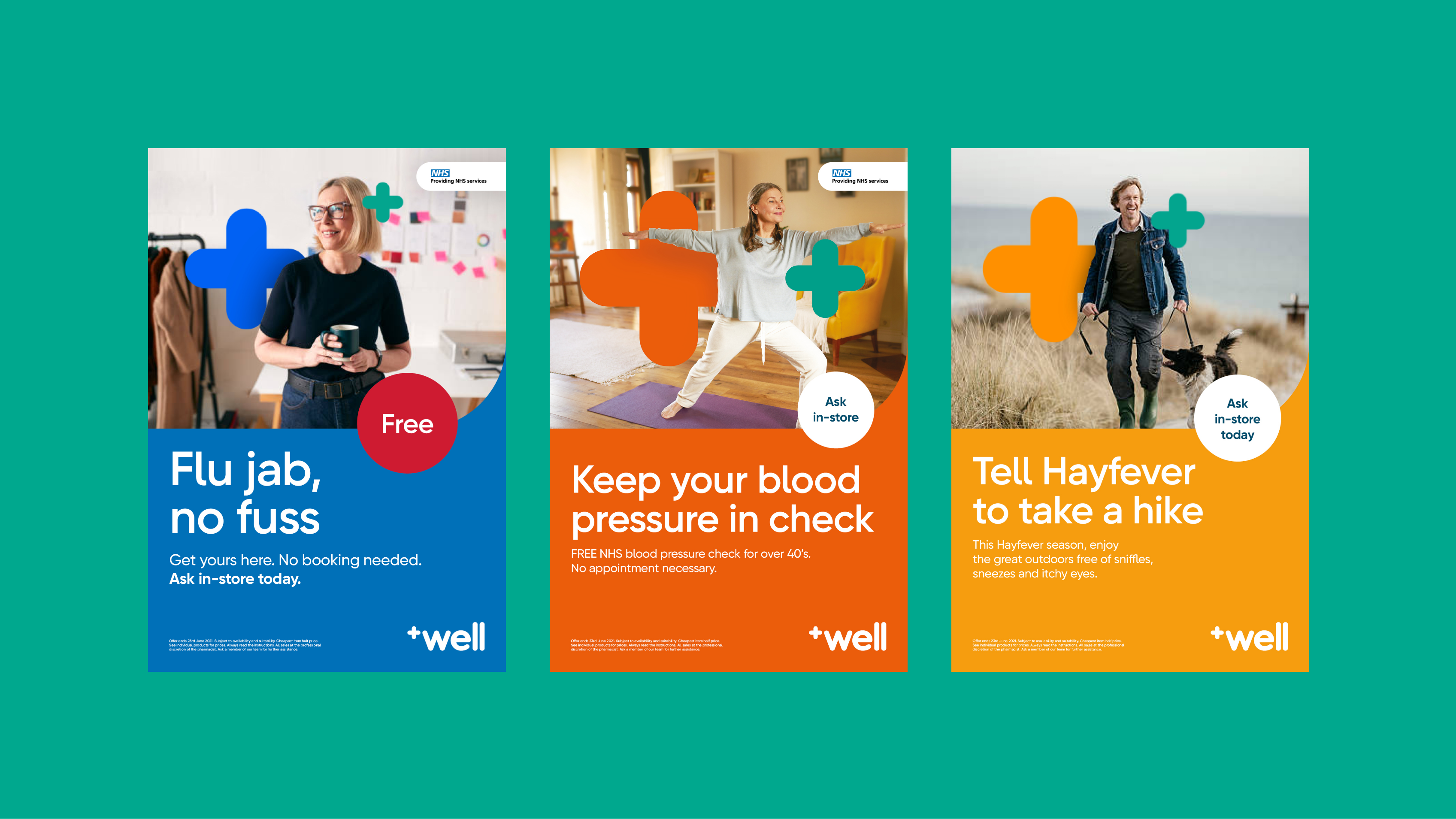
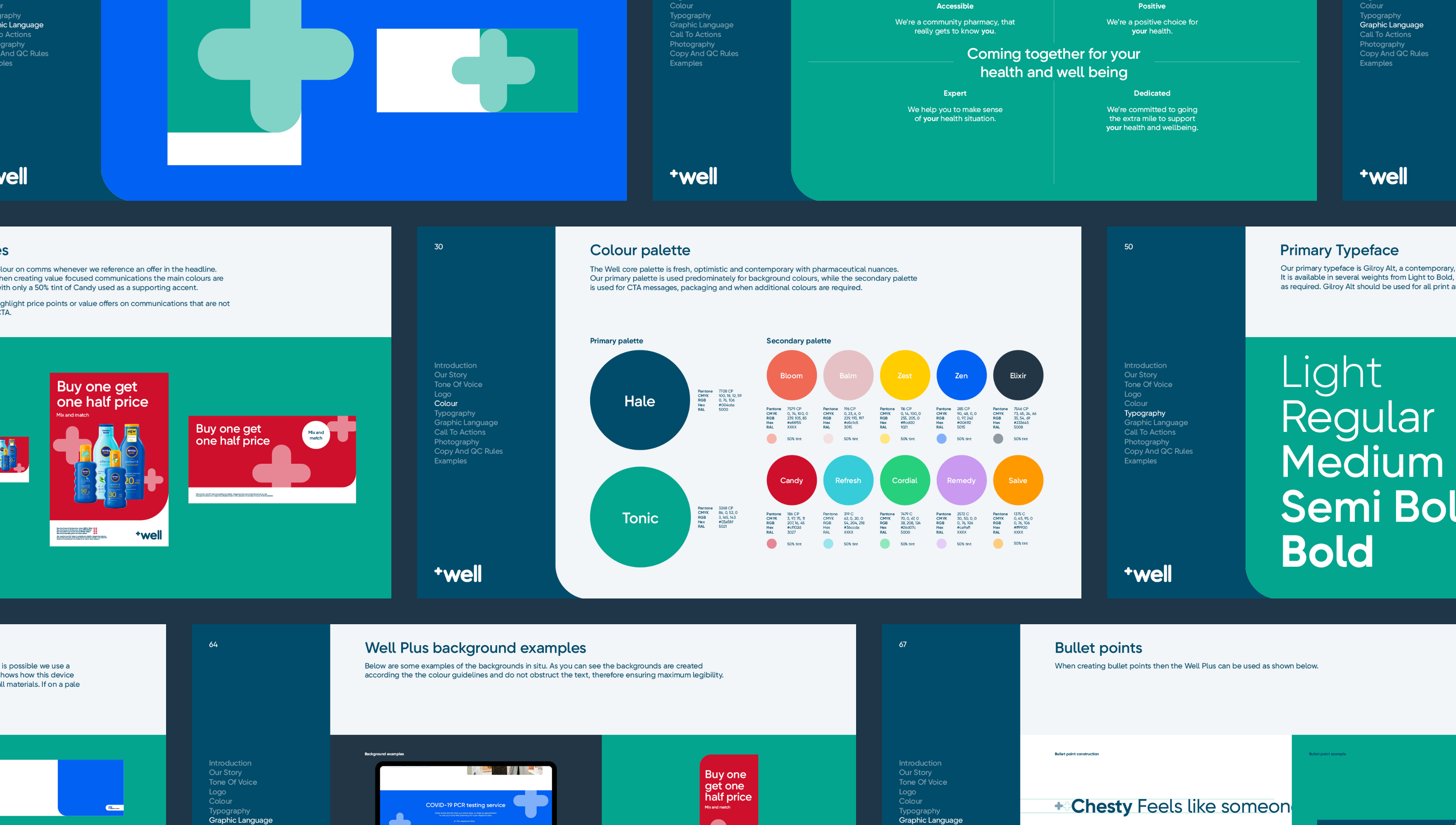
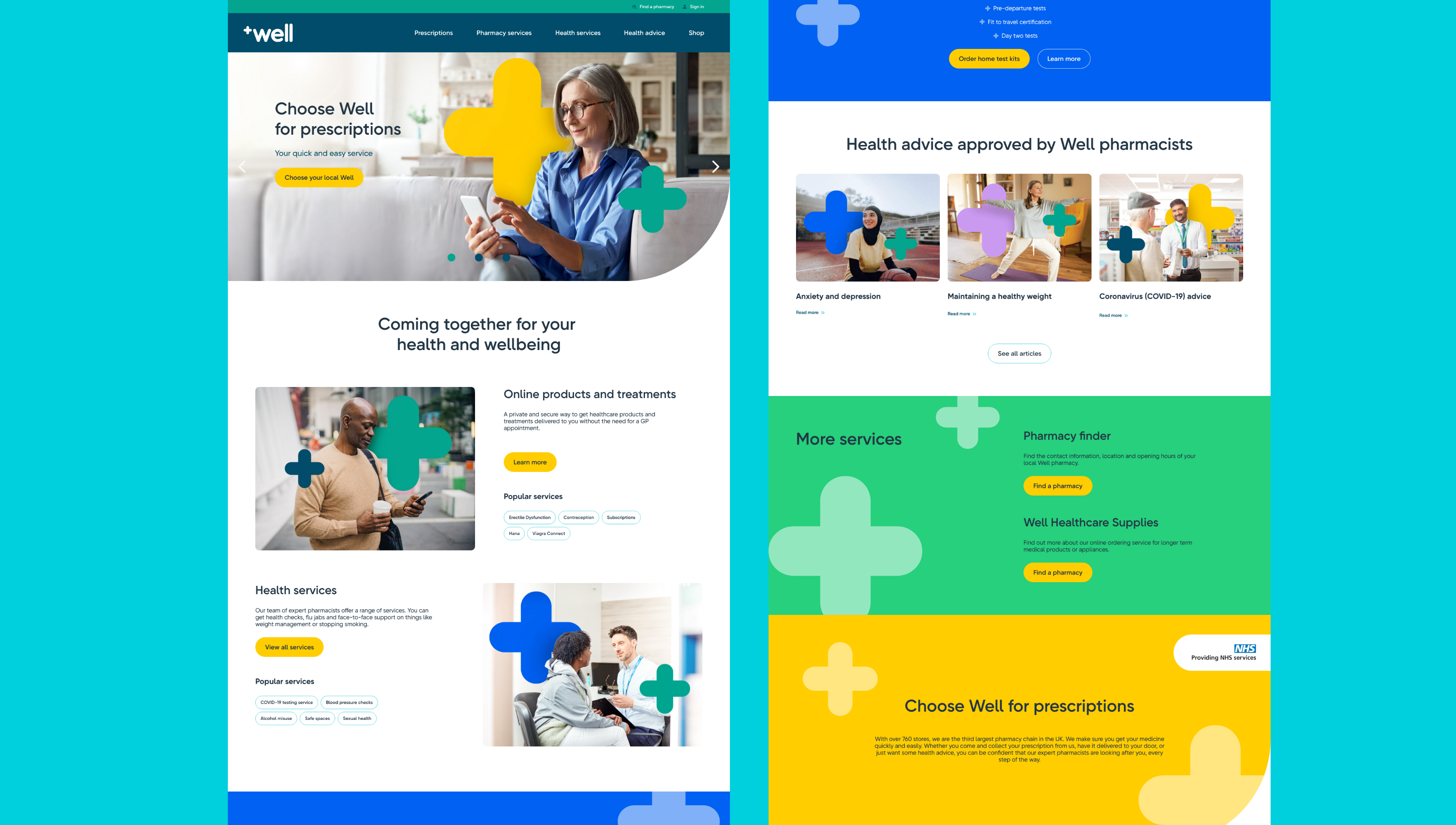
The aim of the new brand direction was to leverage Well’s investment and personal commitment to deliver expert services at the heart of the community.Through research we developed a new positioning for Well; ‘Coming together for your health and wellbeing.’ From this, we built the new branding with assets that could consistently and distinctly be recognised as Well Pharmacy.
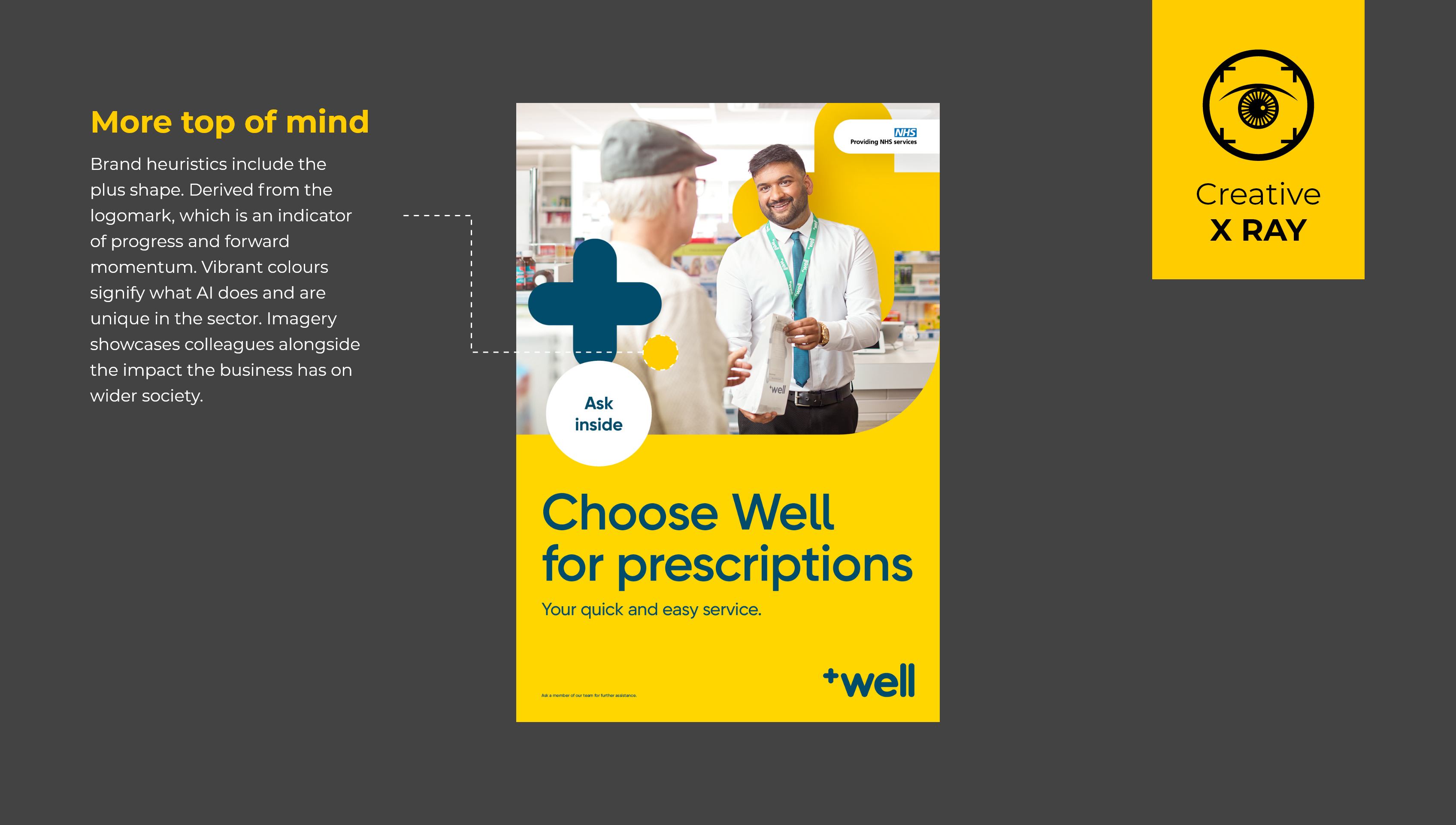
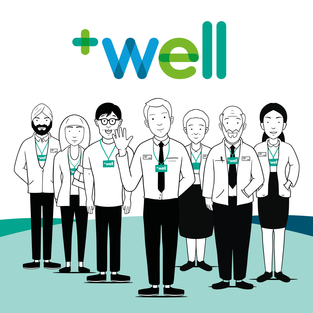
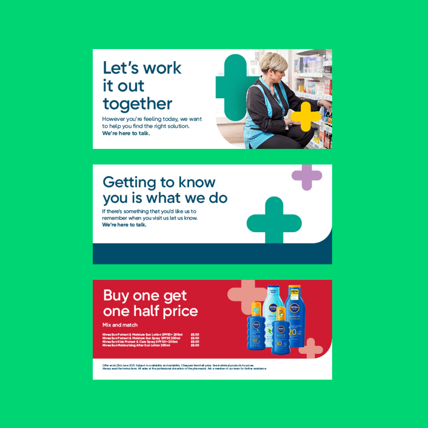
To bring this to life, the Well brand uses the plus, derived from the logo, as a key asset to represent the connection between colleagues and customers across all communications.
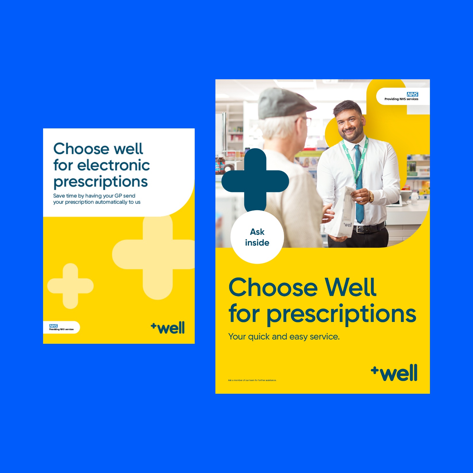

An extended colour palette was also created to reflect the positivity and accessibility of the brand. Alongside a tone of voice that demonstrates Well’s dedication and expertise. The brand design also includes imagery that showcases real community life as well as colleagues in Well pharmacies.
Learn more about how we create distinctive brand assets

The Results
The revamped brand design for Well Pharmacy was rolled out across the entire business both internally and externally across both on and offline channels during 2022.
“The Behaviours Agency’s team offers a perfect mix of pragmatism, intellectual thinking, high energy, a can-do attitude and a relentless focus on the needs of the customer. It is these qualities that have resulted in some exceptional work, for which I would happily recommend them.”
Matt Peach, Head of Marketing at Well Pharmacy