

Is your booze brand doing too much to be remembered?
The Art & Science of Memorability
If there's one thing I've seen more times than I can count in this industry, it's the brief that tries to land everything.
Premium, sustainable, crafted, versatile, heritage, award-winning, perfect for any occasion. Seven messages, one label and a room full of people nodding along because nobody wants to be the one who says "can we lose some of these?"
That's the instinct in crowded categories. Add more. More messages, more design elements, more range extensions, more everything fighting for the same inch of attention. The assumption is often the noisier the space, the louder you need to be, but is it?
Because when everything competes, nothing leads and the brands piling on more are often the ones people remember least. Daniel Kahneman's research on cognitive ease shows that the simpler something is to process, the more likely we are to trust it, remember it and choose it. The more you ask people to decode, the less any single thing sticks.
More doesn't mean more visible, it means more forgettable. So what does the alternative look like? The most memorable brands practise radical simplicity. Not minimalism for its own sake, a decision to be simple when everything around you says be more.
We call it Radical Simplicity, one of our Brand Memorability Hacks, a set of creative levers for brands that know playing it safe is forgettable and being brave is more memorable.
Here’s how that can look.
1. AND UNION built craft beer without the craft-beer clutter.
Not by filling the can with hops, badges, tasting notes and illustration. But with bold colour. One word. Nothing else. On a shelf full of visual noise, the quiet can is the one you notice.
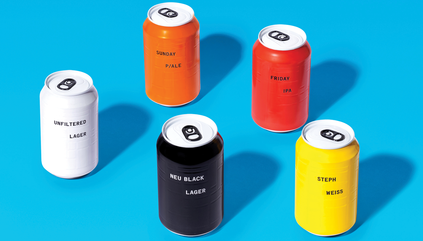
2. Flat White or F*ck Off reduced a coffee shop to a single decision.
Not by offering twelve milks, fifteen syrups and a blackboard the size of a wall. But with one drink. One name. One point of view. You do not remember the coffee. You remember the conviction.
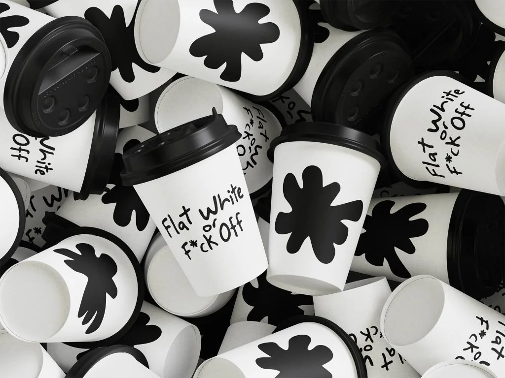
3. Stella Artois removed its most recognisable assets for Wimbledon.
The logo. The typography. The brand identity built over decades. Gone. Replaced with a plain white can carrying nothing but the colour of the tournament. A global brand so confident in what it had built that it bet people would recognise them without being told. They did. And they talked about it.
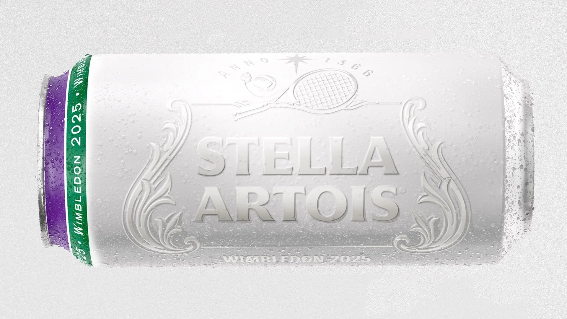
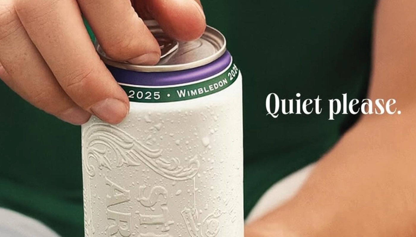
Three brands in noisy spaces that added less and became more memorable because of it.
Now ask yourself: what is your brand still adding that could be getting in the way?
If the answer is "more than it needs," that isn't a visibility problem you can fix with louder work. It's one you fix by stripping back to what actually matters.
Our programmes help brands cut through by stripping back to what actually matters. Not just simpler. More memorable.
