

Behaviour-led tips, advice, insights and thinking

12 Surprising Insights from Nudgestock 2024
Here are 12 of the most surprising insights that we learnt at Nudgestock 2024

A transformation from boring brand to Bradstone
We transformed the Bradstone brand with a bold campaign to re-launch the brand to the market.

Cannes Advertising Festival
Cannes Review - We expected a lot of chat about AI but at the end of the day, we’re united as an industry to do the same thing “good work”.

The Happiness Effect: How brands build long-lasting memories
The role of the psychology of happiness and how brands build long-lasting memories.

Never stop obsessing about crafting brand, design and advertising: D&AD Festival
Our Creative Director, Dorina, went to the D&AD Festival. These are the key things she learnt and was inspired by.

Unlocking the why
Have you ever wondered why people do the things they do? Understanding motivation can supercharge brands and campaigns.

8 tools and tech innovations to maximise retail success
A look at the big innovations in tools and tech impacting the world of retail.

Four key consumer behaviour trends in 2024
Back-of-pack backlash. In 2024, everyone will be looking a little more closely at the food items they put in their baskets. Two big and quite different forces are giving shoppers (at both ends of the wealth spectrum) reason to actively think about their food.

Home, Lifestyle & Garden Trends 2024-25
Here we take a look at the biggest and boldest Home, Lifestyle & Garden Trends for 2024 and 2025. Covering trends, materials and more.

The importance of a memorable brand
Brand memorability is no longer an option – it’s a necessity to building lasting loyalty. But what exactly is it, and how can you achieve it for your brand?
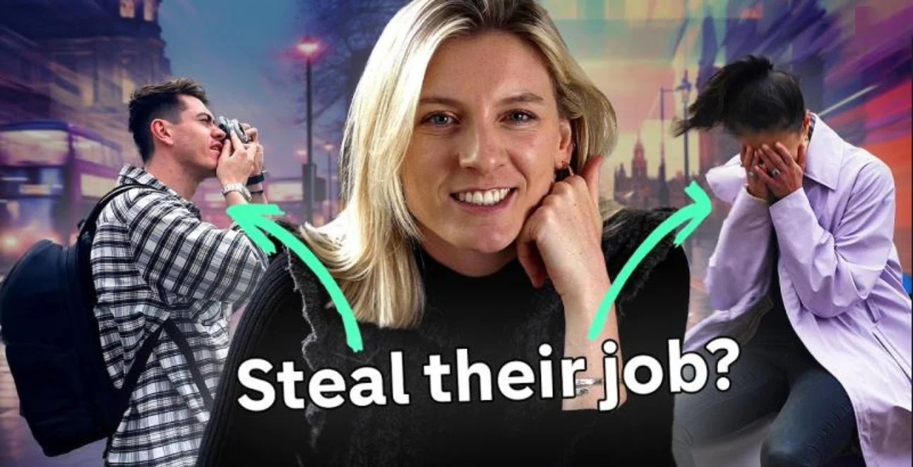
AI vs Agency - can AI take our jobs?
Can AI take our jobs? Alongside Channel 4 we took part in a battle to see if the experts of AI could create a more compelling smoothie brand.

Employee of the Year : It could be Rotterdam or anywhere
The most amazing trip to Rotterdam thanks to our employee of the year scheme and the agency I work for!

WTF is WTF?
Welcome to our community and dinner club for female leaders and future leaders in marketing - Women Thrive First (WTF)

A moment with Amy
A moment with Amy. Sit down and chat with the newest member of The Behaviours Agency team, Amy. She joined us in April as an Account Exec.

The Behaviours Agency achieves B-Corp accreditation
We are so excited to be a B-Corp accredited business. It's good for business, it's good for everyone.

Be the first brand that comes to mind
In the fast-paced world of advertising and marketing, the concept of brand “mental availability” has become a bit of a buzzword. But what does it really mean for your brand, and how can you harness it to drive better results?

Transform your customers’ purchasing behaviour with our simple framework
Six categories of behavioural biases that will help you successfully navigate consumer decision-making.

Savouring lifetime value
Happiness thinking shows us how to use savouring to increase lifetime value.

Build competitive advantage with happiness thinking
How happiness thinking can build competitive advantage into your brand and customer journey.