

Inside Well Pharmacy’s Brand Renovation

Our task for Well Pharmacy wasn’t a total rebrand. This was a brand renovation. A serious refresh. We needed to respect the history. We were always keeping the logo, the typeface and some colours. There was a lot that should stay. These were their consistent assets. They had real value. But the brand felt tired. It lacked a bit of soul. It wasn’t connecting, and it was seriously blending in.
The strategy was set. Well Pharmacies have more services than your average pharmacy and the expertise to really help people in their communities. By speaking to thousands of people, we learned that they feel reassured when dealing with real people, especially when it concerns their health. We just needed to create the motivation for them to connect.
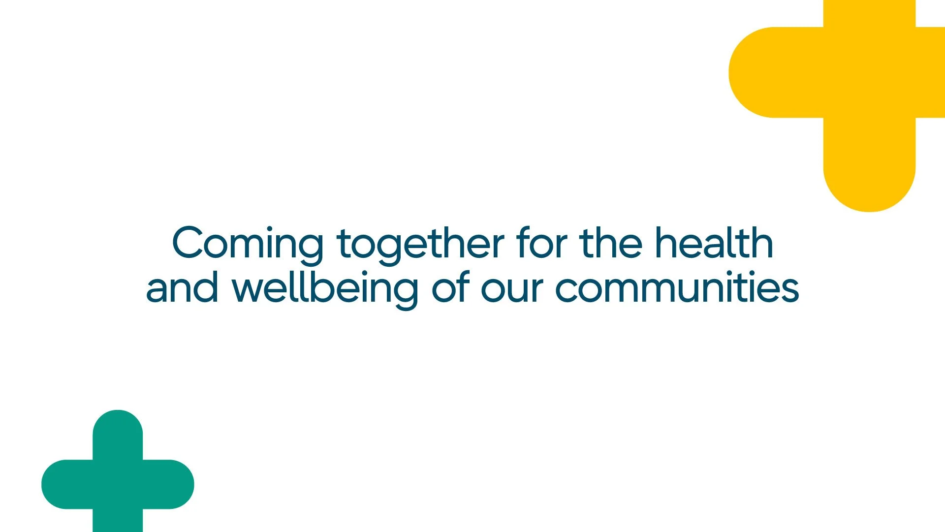
A new brand platform, Coming together for your health and wellbeing, perfectly captured this. So far, so good.
We just needed a visual system that could capture and communicate this. The breakthrough came from the plus. I spent a lot of time staring at the little medical plus at the end of the logo.
Thinking it’s a category staple. And that’s kind of true… but a plus has another meaning, right? It adds things together. Pharmacy + Community. Colleagues + Customers. Service you expect + more.
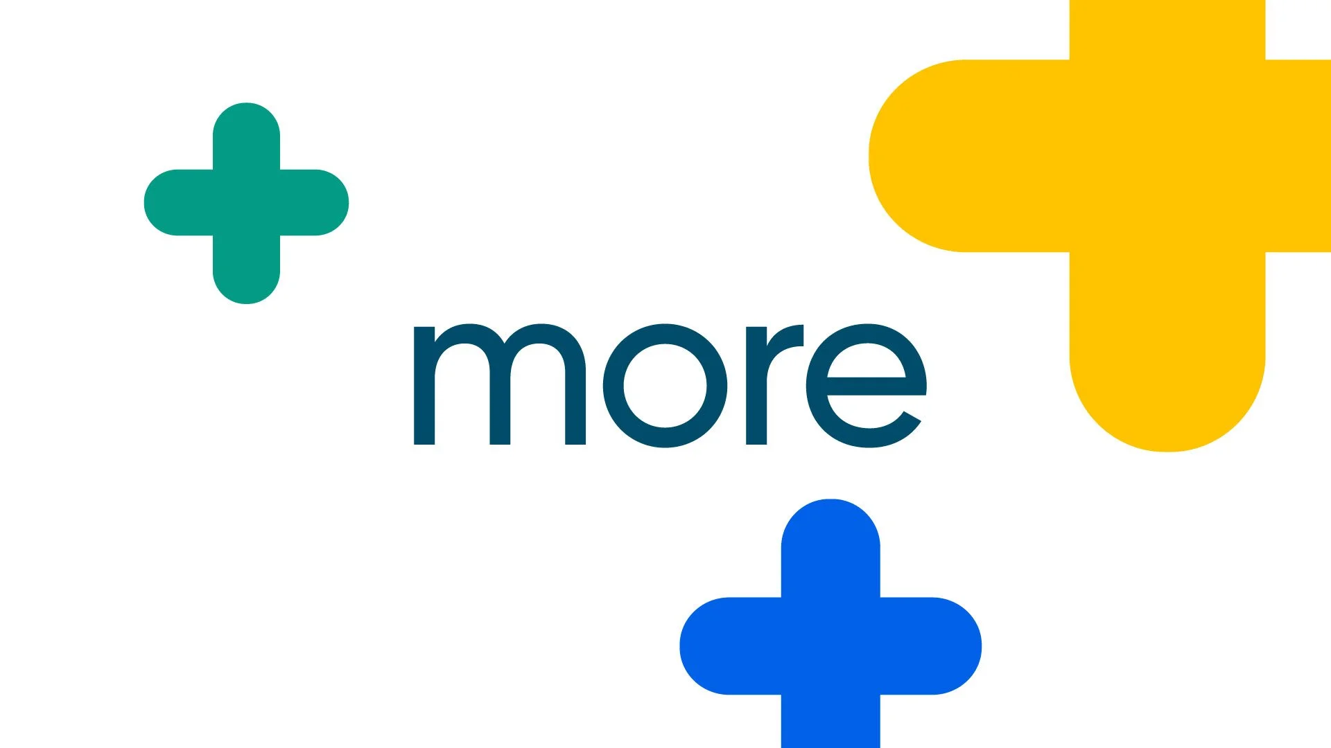
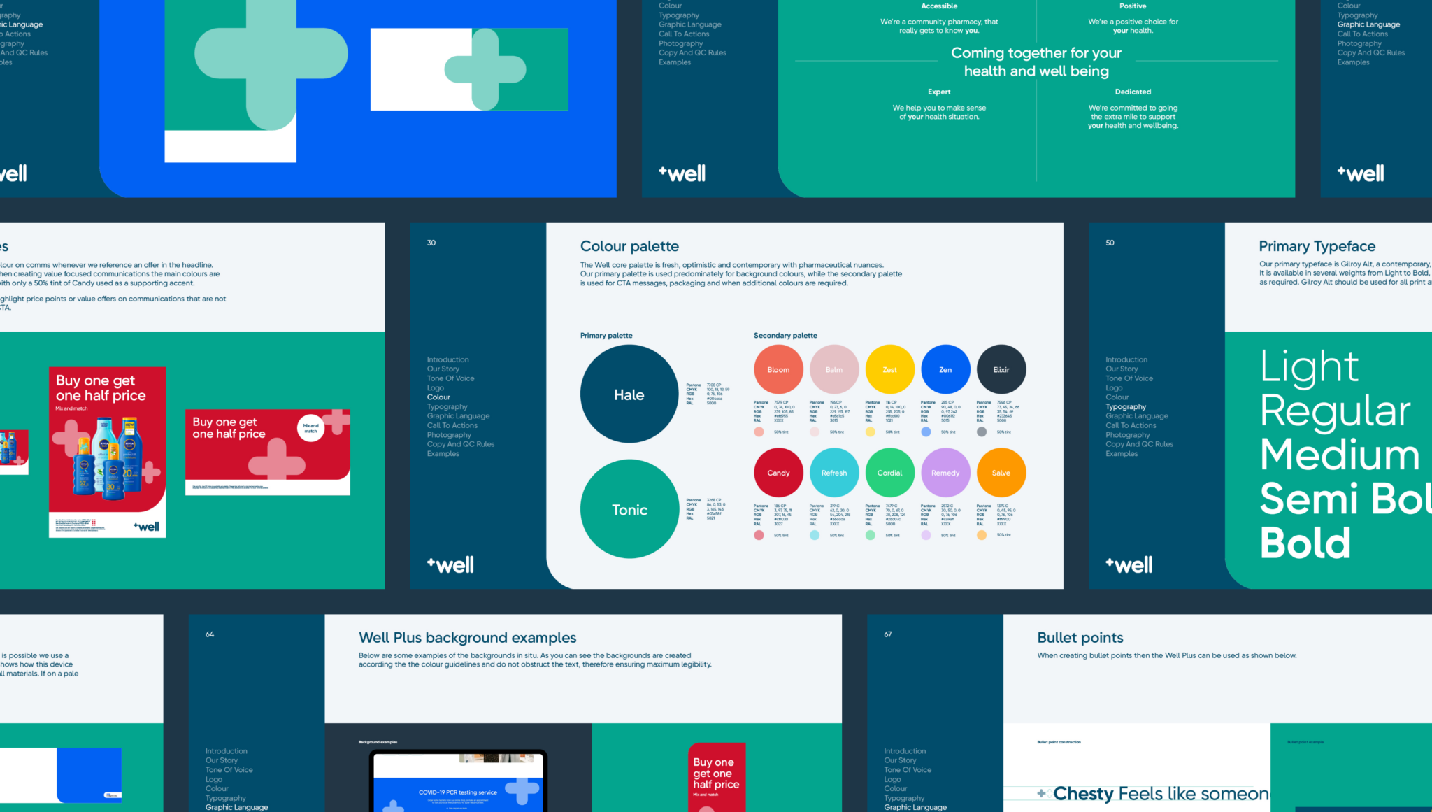
This unlocked everything. Allowing us to double down on an asset that the brand already had. We made the hero shape, the central, distinctive brand asset. Putting it at the core of everything kept us from seeing it as just a symbol and led us to build a strict design system around it.

It influences us to ADD more colour. Most pharmacies live in blue and green. It is a sea of sameness. But Well is more than most pharmacies. We now had the licence to move beyond that. Crafting a palette that pops. It feels fresh. It feels undeniably distinctive. It feels like modern healthcare.

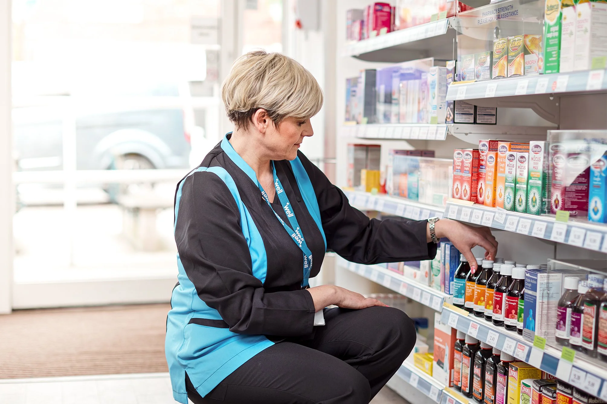
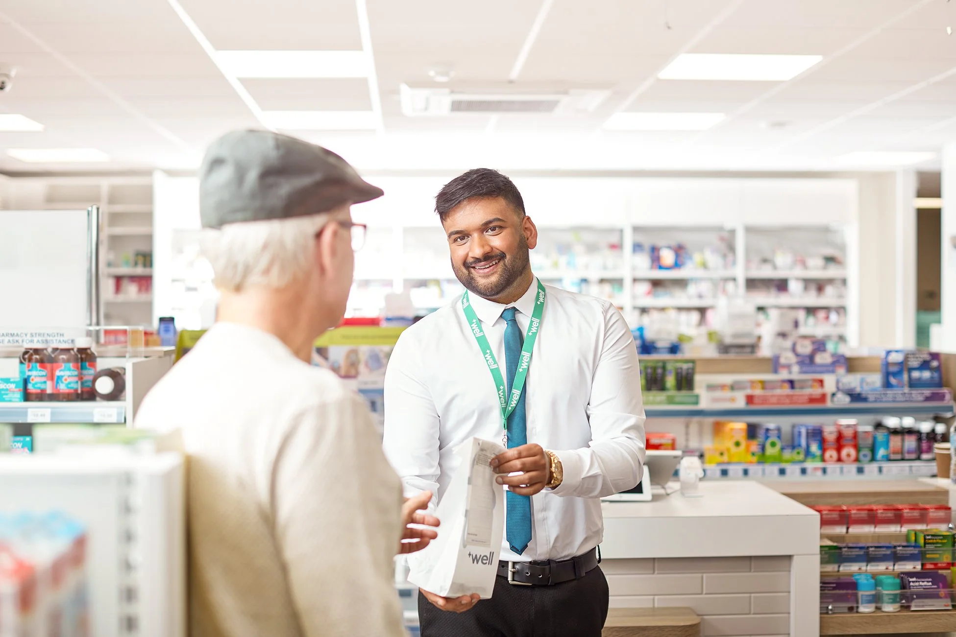
Photography was the final hurdle. We created relatable, engaging imagery that puts the colleagues centre stage. They are the brand’s heart and we know how important they are to customers. We found ways to show them in a way that feels genuine. Real people in real moments. Avoiding the usual pharmacy shots that are so staged.

Then we made clear rules. Building templates for everything. This is where testing was everything. We didn't work in a vacuum, we collaborated closely with their internal teams. Testing at every single stage and checking every touchpoint. It had to work everywhere. Social. In-store. Digital. We wanted to drive consistency over years to build a brand for the long haul. This was wrapped up in updated guidelines that gave the structure, detail and support the internal Well teams needed.
Want to see more? Follow the links below to see our case study or our Brand Renovation program.